According to Sweor, 75% of consumers judge the credibility and trustworthiness of a company based on their website design. It takes less than half a second for users to form an opinion about a website and whether they stay or not.
What does this mean?
First impressions matter!
Think about a time you wanted to try a new restaurant. You walk in to see a menu and notice a bad aroma. While looking around, you also notice nothing looks clean.
You probably didn’t end up staying there very long because the first impression deterred you.
Even if the food was good, you were never going to give it a chance. The same theory applies to your website.
Losing sight of the primary function of your website can be detrimental to your business. Your site needs good aesthetics, relevant content, and accessibility across multiple devices to prove to your customer base that you can be trusted.
Here are some of the best practices seen in web development.

White Space
According to a study from Human Factors International, proper use of white space increases comprehension by 20%. However, that balance of white space to content can be tricky. Have too little, the page will look cluttered. Have too much, the page will seem empty and your message will get lost.
The key to white space is balance. Look for symmetry and consistency with your page so it provides a clear and functional way for readers to view your content. The DailyEgg found that 65% of people are visual learners. So it is imperative that each of your visitors can see and understand your content clutter-free.
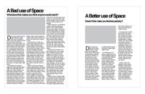
Let’s look at an example.

Source: Digital Ink
See the difference?
Minor changes to a page layout can significantly impact the reader’s experience on your website. The layout on the left is an eyesore and may prohibit a reader from even attempting to skim the material. The closer you can get your content to mimic the clarity of the page on the right, the more likely you are to keep the reader’s interest from the beginning.
Mobile Integration

Source: Oodles Studio
Users are on their mobile devices more than ever.
According to StoneTemple research, 58% of website visits are from a mobile device. So it’s safe to assume that if your site isn’t mobile integrated, you’re already falling behind.
Mobile integration is the act of transforming your website to fit the screen of mobile devices, such as a cell phone or tablet. A properly integrated site will have layouts specifically designed for various screen sizes and will react appropriately to the dimensions of the browser.
Fully functional and responsive sites are a must in today’s digital landscape. This also applies to applications — an app that enhances the user experience from a mobile device will only lend your brand more credibility (as long as the design is up to par). Applications are great because they allow greater accessibility to the user. For instance, take a look at your cell phone. The apps you’ve downloaded most likely correlate to the websites you visit most often on a desktop.
Your favorite brands are already focused on enhancing your mobile experience. It’s time for you to do the same.
Video
People love video. In fact, HubSpot found 54% of consumers wish they saw more video content from businesses and brands they support.
Why?
Because videos are engaging. They capture attention more effectively than any other form of media. According to a study from SearchEngineWatch, videos have a 41% higher click-through rate than plain text. As a result, your traffic to MQL conversion rates will increase, resulting in a trickle-down effect that should impact the bottom line!
The more you cater to consumers’ desired forms of content, the better experience they have. In other words, videos will help implement a more effective Inbound Marketing Strategy.
Final Thoughts
Your website is a pivotal component of your brand. There are millions of websites available to viewers. How can you stand out from the rest?
Proper use of white space, mobile integration, and the incorporation of videos on your website will enhance the user experience. When done successfully, your target market will connect better with your brand, getting you one step closer to hitting your next big goal.
Want to learn more about website development? Check out Volume 2 here!
Or, visit our launchpad site below and learn how we can develop a prototype page in as little as 30 days!


